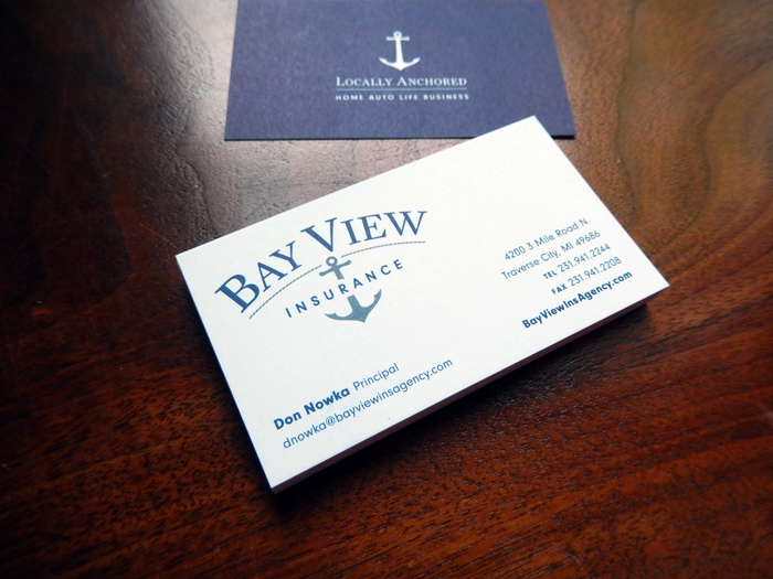
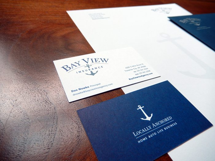
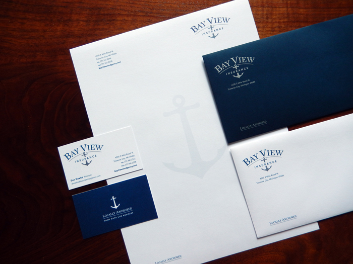
Bay View Insurance
With fresh eyes, the new owners of Bay View Insurance noticed that the company was using several different logos for its marketing materials. For brand consistency, Red Letter Design created a classic logo that's both traditional and unique. The anchor symbolizes security and stability with a nautical reference. Making blue the central color of the brand identity communicates professionalism and trust. The use of both serif and san serif fonts adds interest and makes the name easy to read.