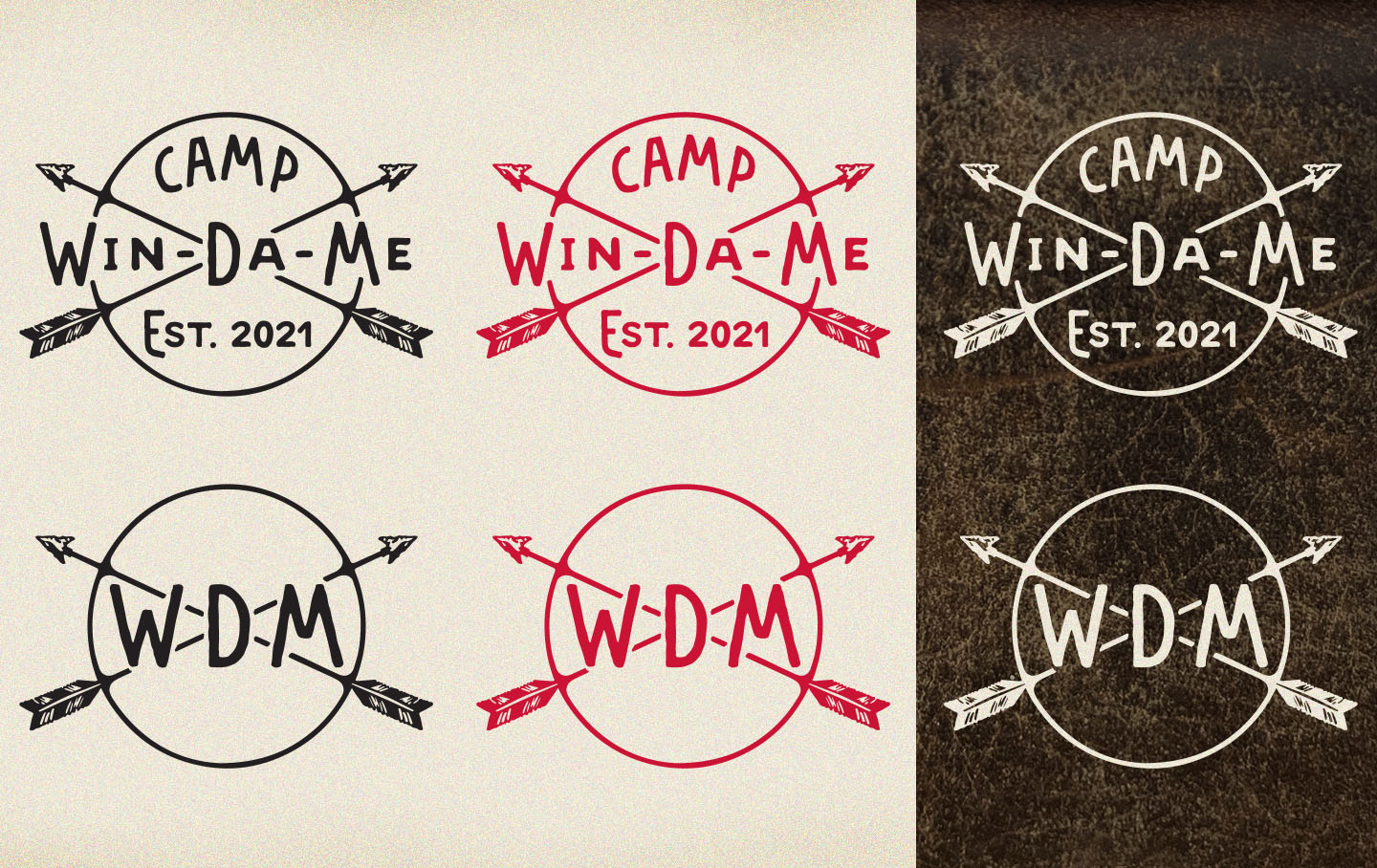
Camp Win-Da-Me
This brand was inspired by the natural beauty of Arbutus Lake and the camp's rustic dwells. The new owners took it upon themselves to gather inspiration and present images they liked such as old school camp logos, patterns, and Native American art. From that and a visit to the camp, Red Letter Design created a brand that married both the past and the future. The arrows crossing symbolizes friendship and affection in the indigenous American culture, and the camp's name Win-Da-Me comes from three members of their family (Windu, David and Melissa). Traditional Northern Michigan colors used throughout the logo with a few modern hues for accent.