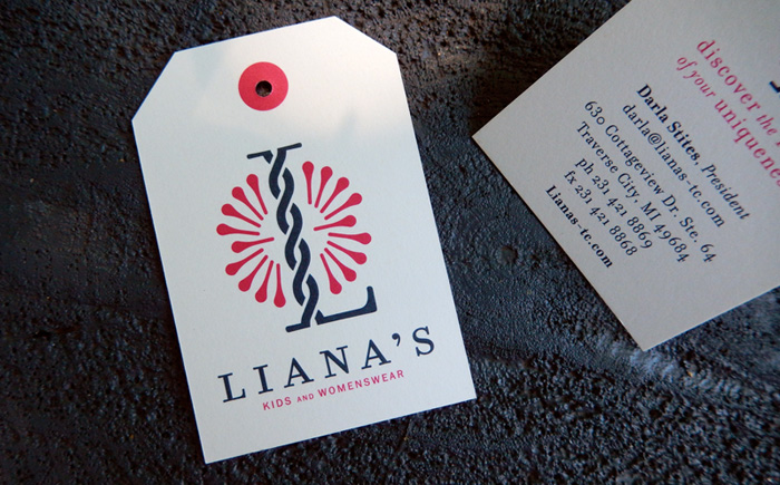
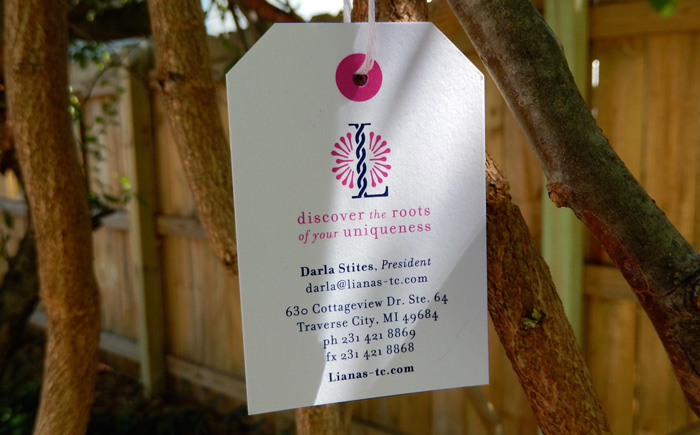
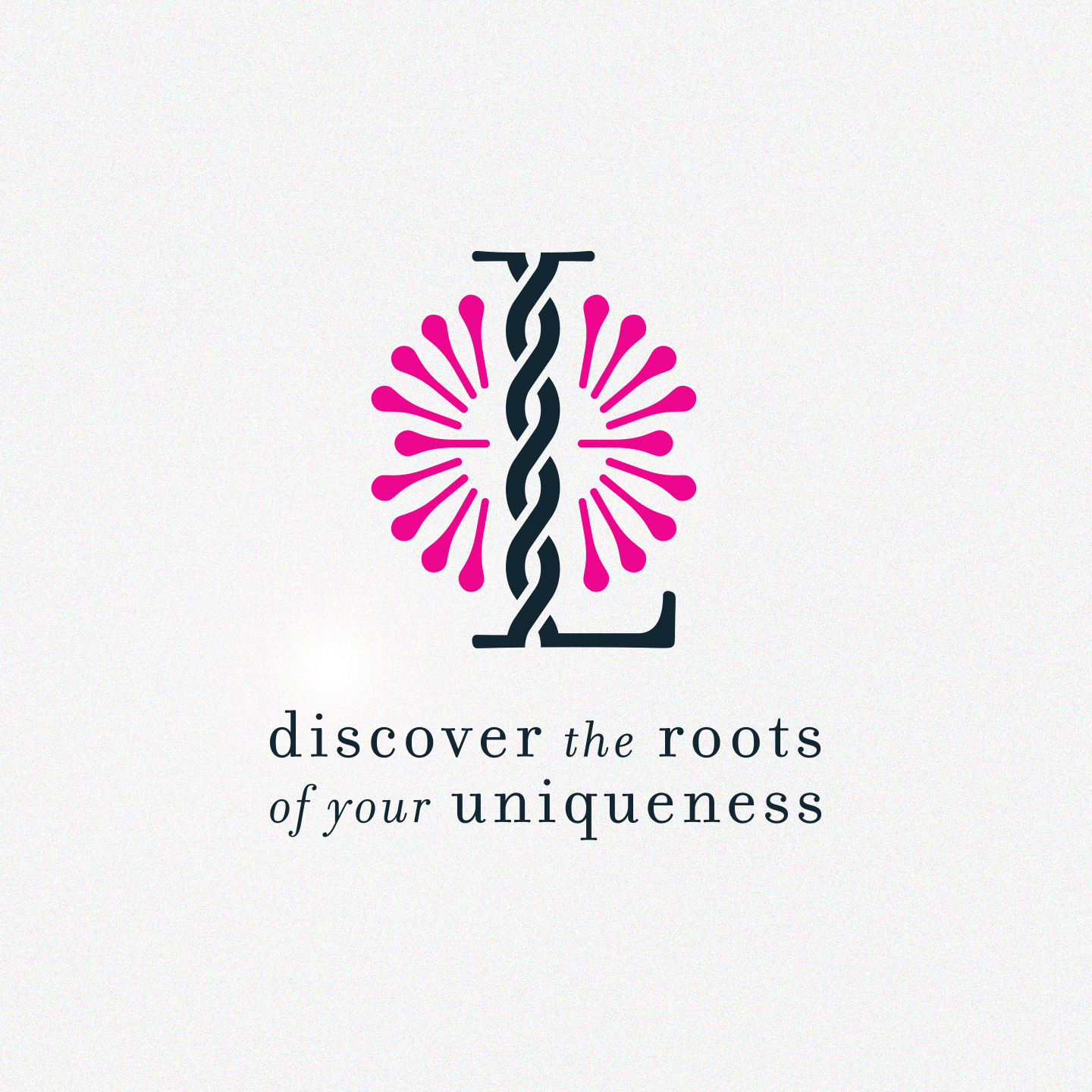
Liana’s Kids and Womenswear
Liana means a long-stemmed, woody vine that's rooted in the soil at ground level and use trees to climb up while they twist around other each other to get access to well-lit areas of a forest. The icon is very much centered around this idea of the "L" representing the vines and accumulation of pinpoints signifying the sun. The bold fuchsia is both feminine and electric while the dark grey is neutral and modern. The combination of serif and san serif fonts creates separation and readability. Due to the logos simplicity, spacing and attention to detail, it'll look amazing in any marketing piece.