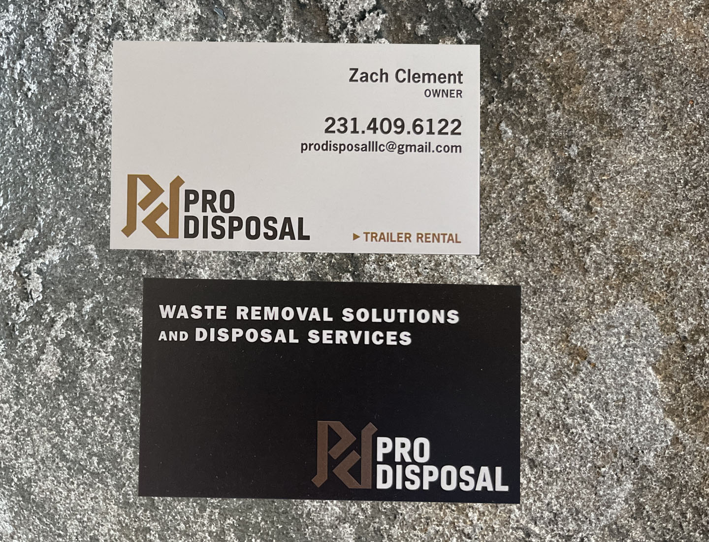
Pro Disposal
Two young entrepreneurs started this company with one trailer and a dream. With determination and persistence, they grew the business and saw a need for a professional looking brand. Both owners like modern and clean lines, and wanted something unique and semi-trendy. Black, white and gold are the corporate colors, plus an icon that has a yin and yang feel with the symmetry of the "P and d" facing each other. Keen on typography, arrow shapes were added to create movement and direction. This company has a lot of potential to thrive.


